American kitchens were historically designed for efficiency (big surprise!). The main concern was having the oven, refrigerator, and sink close to each other (known as the kitchen triangle rule) to optimize and expedite cooking and cleaning.
Efficiency and optimization are still essential in modern kitchen design. At the same time, the kitchen has become much more than just a workstation. Many modern kitchens are open-concept. Having your kitchen literally on display makes design just as important as function. Most kitchens today are also a hub for gathering. It’s a place for meals, working or studying, and hosting.
At the heart of all of these things – optimization, design, and use – are your kitchen cabinets. So, what is the best way to lay out your kitchen cabinets using modern Italian design?
1. Incorporate your lifestyle
As you plan your cabinet placement, and overall kitchen layout – take time to think about your lifestyle and how you use your kitchen. How much cooking and hosting do you do? What are your sustainability goals as it relates to food and packaging (recycling, composting, reducing waste)?
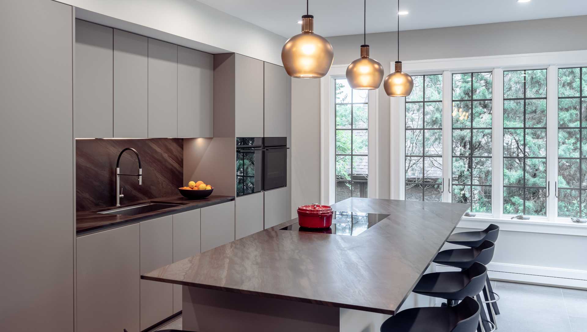
We love this example from the NOLI portfolio, and how the homeowners’ lifestyle is reflected in their kitchen cabinet placement. This layout makes the most of natural light and provides ample storage. The seamless design marries beauty with function – the ideal result for any remodeling project.
2. Plan workstations
Map out ideal workflows in your kitchen using for instance a spaghetti diagram. Is it logical, or practical? If not, re-draw! Think about your main stations and how they are linked together:
- Food storage
- Food preparation
- Baking and cooking
- Serving
- Clean-up
This recent NOLI project is a great example of a layout designed with workstations in mind. The stove, sink, and oven are all near each other – and the eat-in kitchen island is central to it all. The flow of this kitchen provides plenty of room for prep, cooking, and serving – and is an easy space to navigate.
3. Balance beauty and functionality
At NOLI, our approach to kitchen cabinets can usually be described as “out of sight, out of mind.” Modern, minimalist design is about clean lines and concealing while organizing clutter.
Although we are always design-forward in our work, we don’t sacrifice functionality. The ideal kitchen cabinet layout encapsulates both design and function.
This project from the NOLI portfolio is a prime example. The monolithic design is flawless, and so is the functionality of the space. Again, there’s close proximity between the main functions with tons of space for meal preparation as well.
Our Favorite Cabinet Layouts
There are specific shapes referring to ‘standard’ kitchen layouts (U-shaped, L-shaped, galley, single wall, etc.). At NOLI we focus first on the lifestyle and workflows of our clients versus standard layouts. Regardless of the overall kitchen plan, a few of our favorite cabinet placement tips include:
- Having a pullout trash and recycling cabinet next to the sink, mirroring the dishwasher, and creating a one-stop cleaning station.
- Slotting cutlery and dinnerware drawers next to the dishwasher in the kitchen island. This setup makes for a closed-loop process, from place setting at the eat-in area, to clean up, and put-away.
- Placing a pullout pantry next to the refrigerator for a one-stop storage and retrieval area. This makes the grocery put-away process and meal preparation that much easier!
We’ve helped dozens of homeowners in the greater Cincinnati area with their kitchen remodeling projects. At the end of the day, the ultimate kitchen cabinet layout is the one that works for you and your lifestyle. And of course, incorporates modern Italian design.


